DNV

How I turned the chaotic management of oil wells into an interface that is easy to understand.

A system for the quantitative assessment of well blowout risk during the operational phase of the well.

Europe & Brazil

Location

Product Designer

Role

2024 - 2026

Date

DNV
Noruega

DNV is an independent assurance and risk management specialist operating in more than 100 countries. Driven by the purpose of safeguarding life, property and the environment, it empowers its customers and their stakeholders with trusted data and insights, so that critical decisions can be made with confidence.

WHAT IT IS

MyBarrier Well is a quantitative blowout risk assessment platform developed by DNV

in partnership with

Petrobras

Well integrity engineers use the tool to make critical decisions about barrier failures during production, intervention and temporary abandonment phases — decisions that can prevent environmental accidents and save lives.

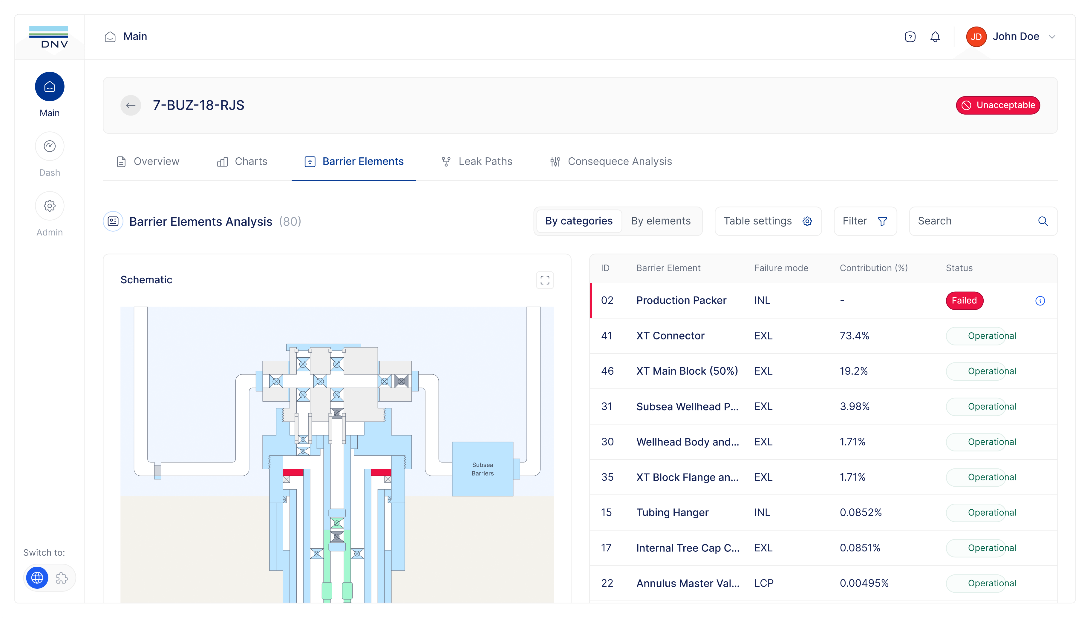
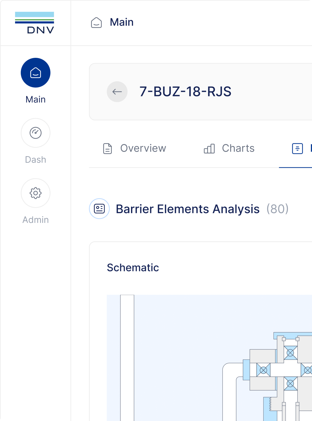
MyBarrier — Barrier Elements Analysis

BEFORE

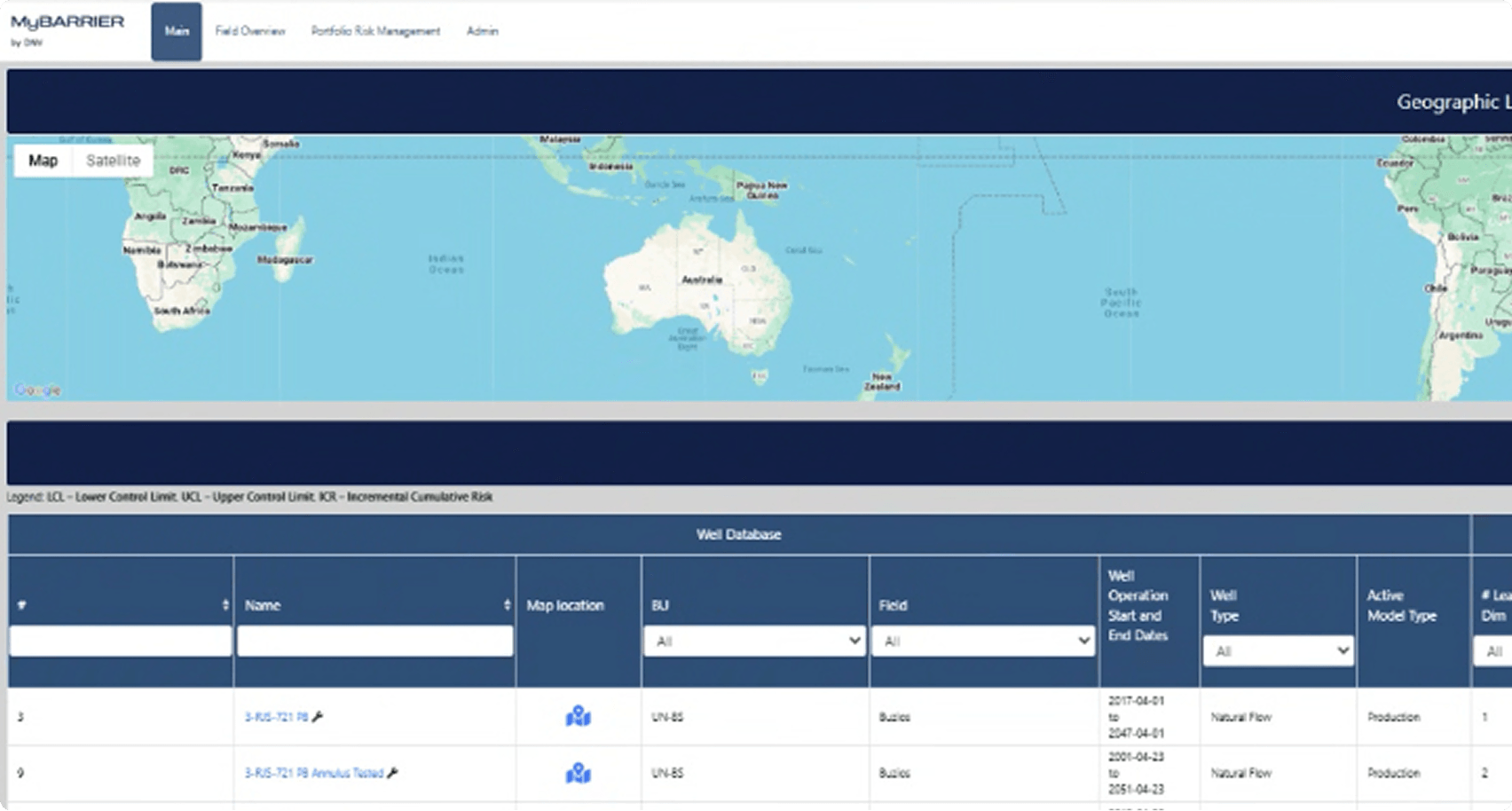
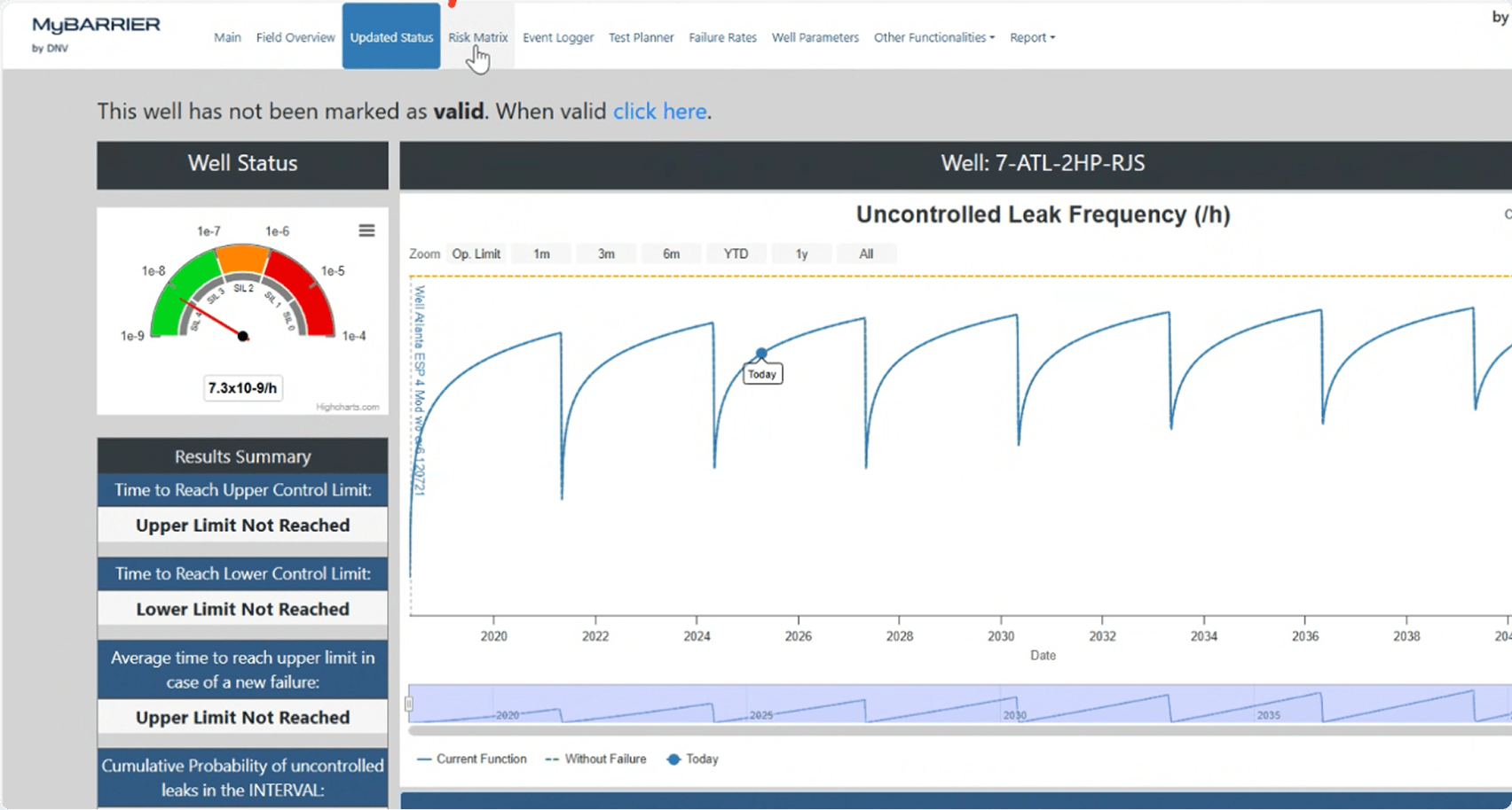
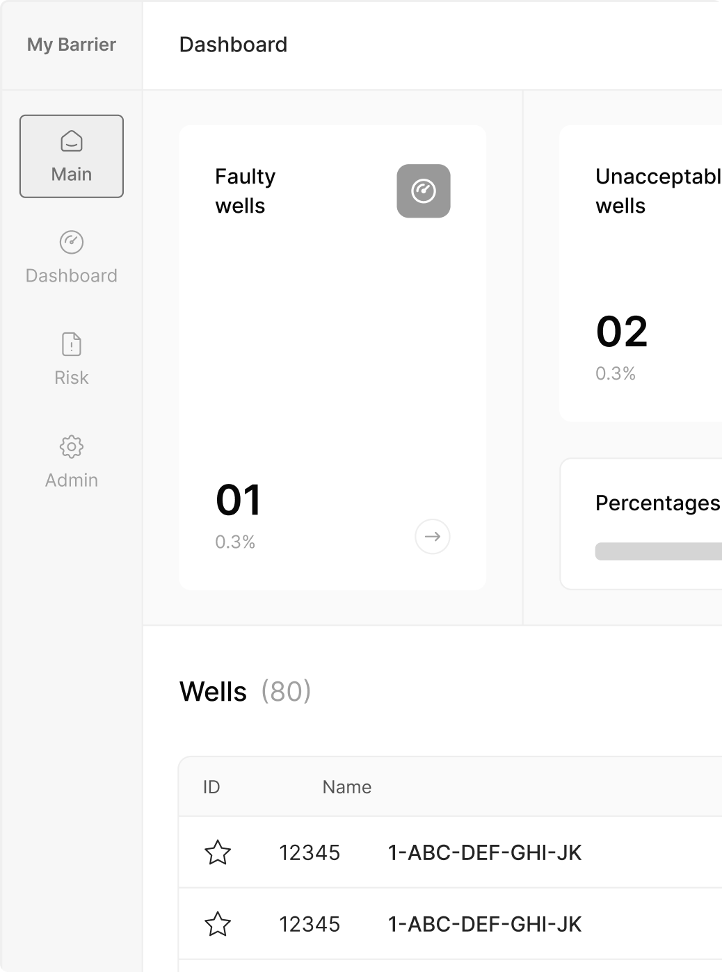
Something already existed when I took over the project. But all of it was hard to understand. It demanded a lot of effort.

We needed to translate the risks of a well into clear visual decisions that are easy to perceive.

Screenshot of the old system.

PROCESS

So I dove deep into the project to understand what to keep, what to improve and what to invent from absolute scratch.

  1. 01

    Product discovery

    Sessions with the client and engineers to understand the business rules and the domain before any design decision.

    • Domain
    • Business rules
    • Stakeholders
    • Kickoff
  2. 02

    Persona definition

    Mapping the user profiles. Their contexts, needs and access levels inside the platform.

    • User profiles
    • Context of use
    • Permissions
    • Behaviors
  3. 03

    Initial ideation

    Exploring solutions for the challenges, focused on simplifying complex flows without losing functionality.

    • Brainstorming
    • Exploration
    • Design decisions
    • Creativity
  4. 04

    Architecture and scope

    Defining the system modules and how they connect, making sure the structure could hold the complexity.

    • Structure
    • Navigation
    • System modules
    • Flows

CONCLUSION

After understanding how each flow worked, a few things became clear.

Carlos Mendes

Carlos Mendes

Integrity manager

He has technical knowledge. He makes sure no well under his management shows risk or evidence of leakage. He needs to:

Access critical information quickly and precisely

Spot problems without having to interpret the data

Ricardo Alves

Ricardo Alves

Operations manager

He has no technical background. He doesn't understand the system, the reports or the analyses the engineering team produces. He needs to:

Understand the impact of a failure before it happens

Read executive reports without technical complexity

In other words, the old system solved neither the engineer's problem nor the manager's.

With everything mapped, the main challenges of the project emerged.

  1. 01

    How do you translate a probabilistic model into clear visual decisions for technical engineers?

  2. 02

    How do you cut the time it takes to read a well without hiding the analytical depth the engineer requires?

  3. 03

    How do you create a single visual language for something that only existed as numbers and tables?

  4. 04

    How do you design for two audiences with completely different backgrounds?

  5. 05

    How do you let engineers test hypotheses without putting the real well data at risk?

We sketched, tested and arrived at a few ideas.

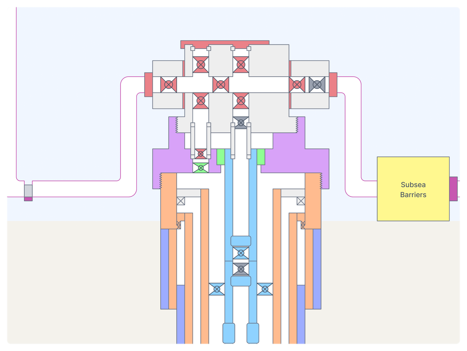
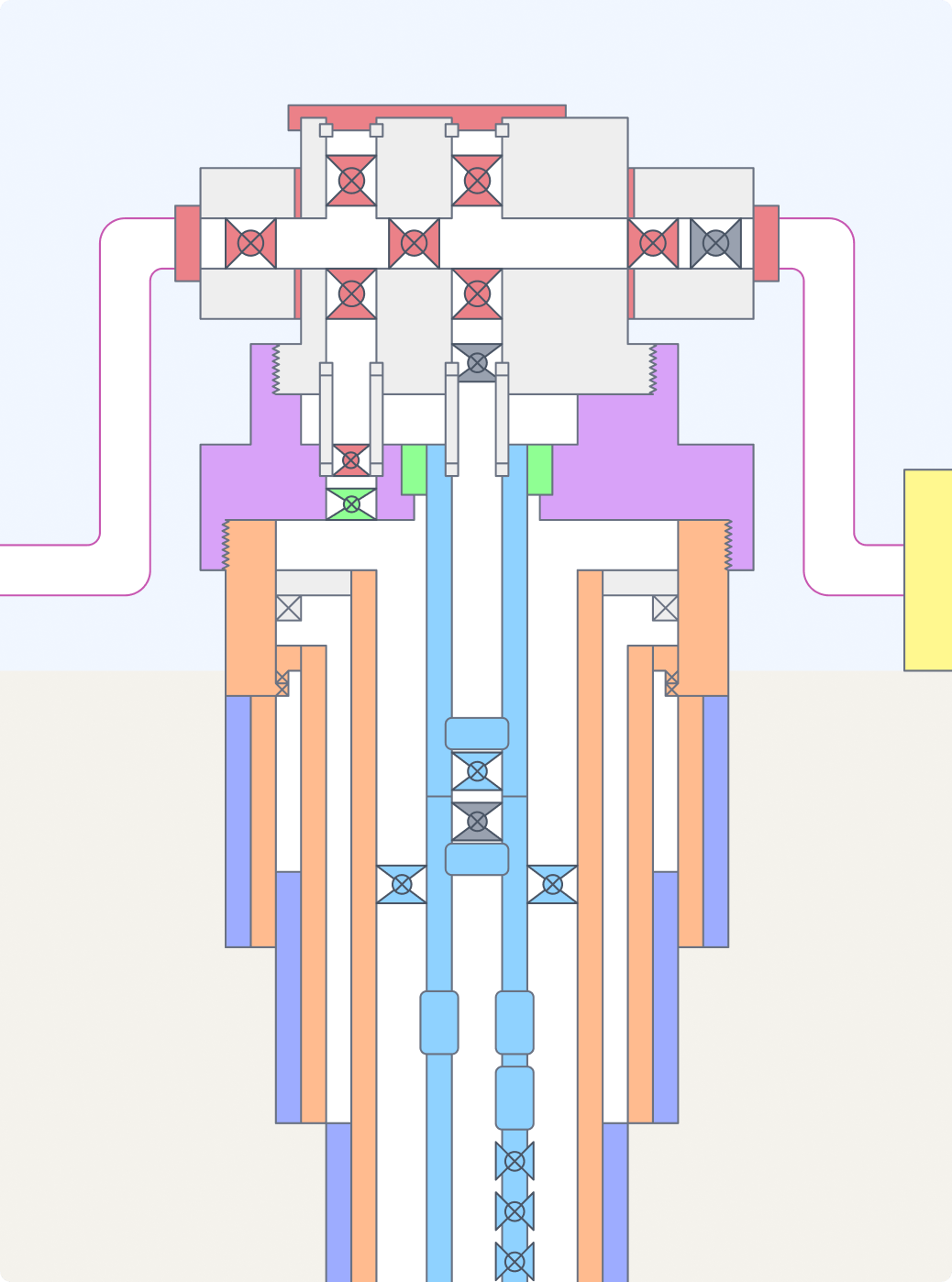
2D well plans as an alternative to tables.

To replace the table view, we created visual representations of each well — 2D plans that show its containment barriers spatially and intuitively. The engineer stopped interpreting data and started seeing the well.

The problem becomes something you locate, not deduce.

Interactive elements with details on every barrier

Immediate visual location of the problem

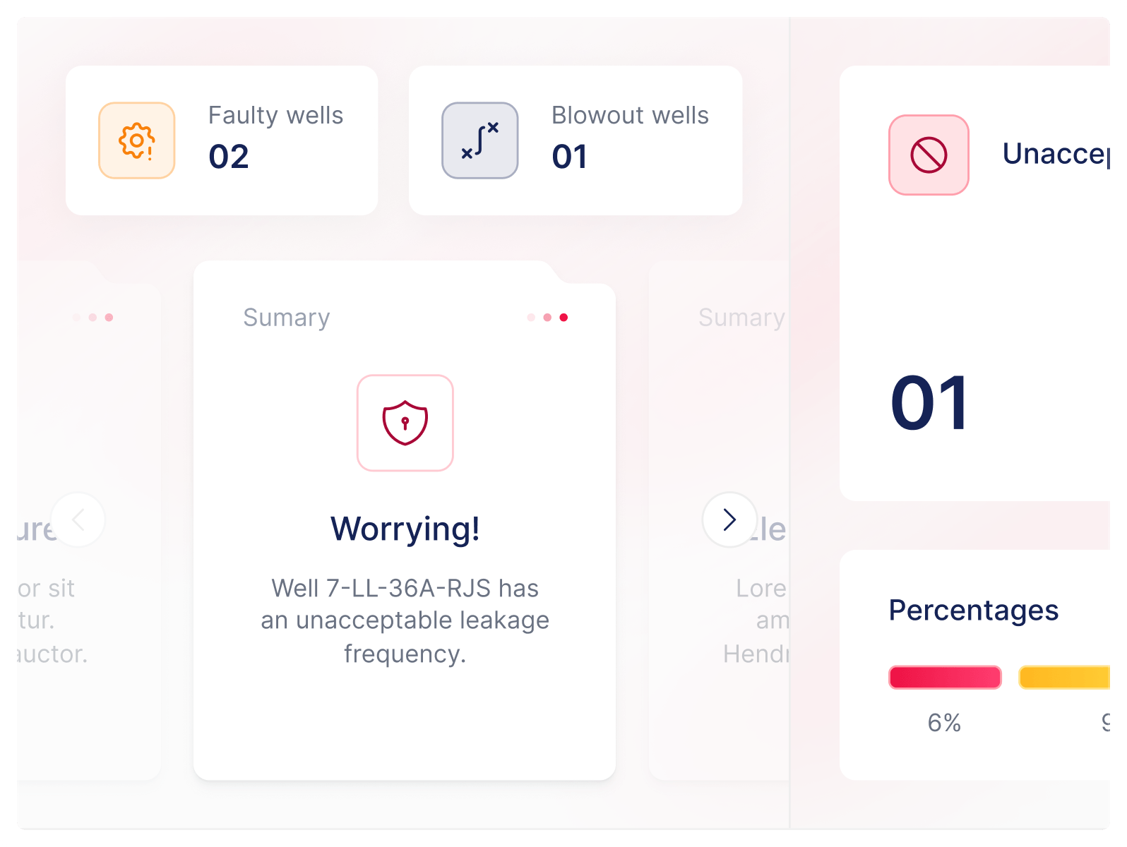
An interface that communicates through ambiance

To fix information overload without hierarchy, the interface started using color and ambiance as its main language. The whole screen changes state — green, yellow, red — reflecting the real situation of the wells.

The engineer grasps the scenario before reading any data.

Overall state perceived in seconds, no reading required

Visual hierarchy that guides attention to the problem

Simulation mode

To let engineers test hypotheses without impacting the real environment, we created a switch that toggles between the operational and the test environment. In simulation mode you can change barrier states and observe how the well would behave.

A decision tool that simply did not exist before.

Hypothesis testing without impacting real data

Anticipating consequences before changes to the well

Then the work stages began:

Wireframe

Low fidelity to validate the logic of the screens before spending time on visuals. We tested where each piece of information should sit, with no color and no distraction.

Wireframe

Flows validated with engineers before the visual layer

Navigation tests straight with the people using the system daily

Building the 2D plans

We created templates covering the most common well types — the structure barely changes between them. Each plan starts from a template and only gets the specific adjustments.

Building the 2D plans

5 templates covering the main well types in the operation

Targeted redraws instead of rebuilding the whole plan every time

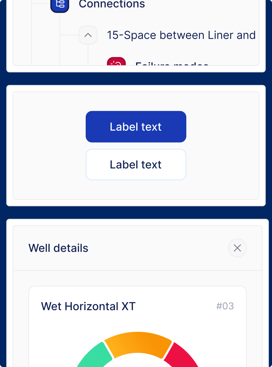
Design System

Reusable components to handle 100+ screens without each one becoming its own special case. They came from the product's real needs, not from an off-the-shelf kit.

Design System

Patterns created from real cases in the platform

Consistency across modules without redoing work on every screen

Visual Design

Final application of the system on the production screens. Focused on information density without turning into visual noise.

Visual Design

Visual hierarchy designed for fast decisions under pressure

Color and ambiance as part of the language, not decoration

RESULT

And two years later, a product in production.

In the end, which problems did the redesign solve?

-60%
Reduction in the time it takes to assess which barrier elements are at risk inside a well.
-45%
Reduction in the time it takes to identify which wells are in a critical risk zone on the home screen.
Immeasurable
Drop in data-reading errors after the visualizations were redesigned.
100%
Every assessment and strategy change logged and auditable.

WHAT I LEARNED

To design a complex product, understanding comes before designing. Before touching a single screen, I had to understand how a well worked, what counted as risk, why it counted and when it counted.

Mapping pain is not enough. You have to understand why each pain exists, otherwise you solve the wrong symptom. Or make what was already bad worse.

That is the level of technical fluency that separates a design that only looks good from a design that solves. On this project, most of the work was not arranging screens, it was building up enough technical context to know exactly what each pixel had to carry, and why.